With my Year 7 class we have recently been studying various aspects of data handling, including averages (including from frequency tables) and a variety of graphical representations. With the end of term drawing near, and having completed the scheme of work ahead of schedule, I decided to do one of my favourite projects with the: the Average Student (available to download from TES).
This project uses many areas of the data handling cycle, and in my opinion is an excellent way to get them to see the whole process.
Once I had introduced the task to them, we started off by discussing what kinds of information we could collect about the class. There were lots of good ideas, and a few more abstract ones as well, and we started to build up a spreadsheet of all the data that we wanted to include. It is really important (in my opinion) to let them decide which information it is that we should collect to give them more ownership over the task. I would recommend having a few ideas to include if they don't come up with any though. Height, eye colour, shoe size, number in family, etc are good ones, as they cover the different types of data.
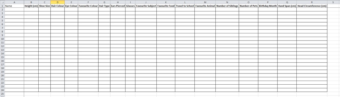
The blank spreadsheet ready to input data.
Once we had decided on the different things we wanted to have data on, I split the class into small groups to measure and record this information about each individual. Once they were done, they had to input their data into the spreadsheet, which was still projected on the board, until the whole spreadsheet had been filled. This included my data, so I was also part of the collection process (I did this for a very good reason, being that I provided outlier data for most of the areas). On reflection, this took a long time, and a better way would have been to use a Google Doc Spreadsheet (or Google Doc Form), and have them fill in their information at home.
With the completed spreadsheet, I split them into their project groups, and outlined what I expected from their project.
They had to produce a poster on the "Average Student" of the class, and it had to include analysis of at least 6 of the areas we had collected data of, and for each one they had to give an average and why they chose that average, along with a chart of some form to represent the data. There had to be at least one Pie Chart and at least one Bar Chart/Frequency Diagram, but other than that, they could choose. There also needed to be some form of question, and I wanted it to be colourful, as it is a poster after all.
We also discussed my data, and how it affected the overall averages, and each group was allowed to choose if they wanted to include my data or not.
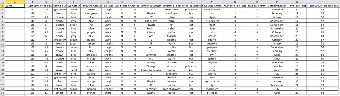
The complete data of my class.
I ensured they had plenty of time to plan what they were going to do with their poster, before actually allowing them any poster paper. This project also incorporated two homeworks, so within their groups they had to assign tasks to each individual to do at home (my suggestion was to draw charts as they are time consuming and do not rely on the others to be there).
They had a double lesson for the collecting data, and to begin their planning, followed by another single lesson planning. They then had two homeworks, two singles and another double to complete the poster. In total, that is about 5 hours 30 minutes.
There was a huge amount of thinking taking place throughout this project, and every students was involved in the whole process. Each group came up with very different ideas on how to present the information, but they all made sensible decisions about which types of charts to use. It gave them a complete overview of the data handling cycle, and they took a lot from the experience.
Below are the completed posters.
 RSS Feed